Musings #2: art style
This entry will be about developing visual art styles!
I want a style that allows a simple workflow and forgiving of mistakes. I also want to avoid the uncanny valley and to maintain the suspension of disbelief. This is based on the kind of game I want to make.
I plan to have two types of gameplay, and they are are better suited for different styles:
- The world has many objects, people and the like. The main character moves on a field, and can interact with various things
- Scenes with a well-defined start and end, that act as a reward, and usually have a single person and a single object
The world has the simplest style. The scenes, even if they will have less drawables, each drawable will have more components, they will be bigger, and animations will have more keyframes.
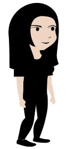
For the world’s simplified style, I took inspiration mostly from Witch Trainer(NSFW), Helltaker and the lesser known Ghostlight.
- Witch Trainer uses a 3/4 perspective for most situations. This makes sense, because it's best if the characters face the screen, but the characters are supposed to be facing each other in-game
- Helltaker uses a flat (no shading) style with a limited color palette
- Ghostlight also has flat colors with a limited palette, but with more varied shapes than Helltaker
So I ended with things like these:


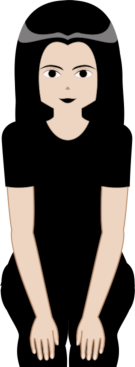
For the scenes, I took inspiration from 13 images. 9 were realistic images found through search engines, while 4 of them were drawings. Since 7 of them are NSFW, I'll leave them to your imagination.
I want the scenes' style to be a more stimulating version of the world's style. That meant avoiding line art, using a limited palette, and similar shapes. Some details omitted in the world’s visuals are in the scenes like the white of the eye, eyelids, fingers and nails.
I had problems due to the lack of line art and shadowing, especially if I removed the clothing. The shape of overlapping body parts is hard to tell apart, since they have the same base color. To fix that, I had to do things like add borders to arms. In the future I will use line art at least for the skin, but I may also use line art for clothing and hair. This is the style I ended up with:

That’s it for the static visual style, but what about dynamic animation styles? Some questions I had were, do I use bone animation or frame-by-frame animation? Do I want cartoony movement or realistic movement?
I have little experience with animation, just a bit with Blender. I prefer to use Libre Software if possible, so I looked at 2D alternatives. Among them were Pencil2D, Synfig, and OpenToonz. Pencil2D is for hand-drawn animations, but I’m using vectors created in Inkscape. OpenToonz seemed a bit too advanced for what I wanted, so I tried Synfig.
Synfig is capable of doing what I wanted (and in the end I did), but I found several issues:
- Outdated documentation
- Data-corrupting bugs
- A few operations are excessively slow
- Incomplete interoperability with Inkscape. The best option ended up being the outdated .sif export from Inkscape
Feature-wise, the only thing I wish Synfig would have is animation using vertex weights. Spine, Spriter, Dragonbones and OpenToonz’s plastic tool represent what I would like. Synfig has bones, but there's no fine-grained control. This meant the choice of bones vs frame-by-frame was made for me in favor of frame-by-frame.
Regardless, Synfig made it easier to learn animation concepts compared to a more complex tool. I learned about things like keyframes, tweening and walk cycles while I battled through animating. This made me realize I want realistic movement, that is simplified by omitting details.
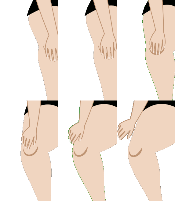
I also realized, after finishing the scene’s animation, that I had done a pseudo 3D animation:

Even if the shading is flat, the leg movement resembles movement in a 3D space. That’s when I realized I should have done the scene’s animation in Blender all along, duh! Either way, I plan to remake the Scene in Blender, and that should also lead to a better workflow.
For now, the world’s animation will remain in Synfig. I tried to switch to Dragonbones, but it turns out that it only works with raster images, and the same goes for Spine and Spriter. I’m also less reliant on the documentation now, and I learnt workarounds for the bugs. I’m not opposed to switching, but I'll need a good reason, and if I do switch my options are either Blender with orthographic projection, or OpenToonz.
At this point, I created an idea of the visual direction based on the game concept, then looked for inspiration, and tried to find a suitable toolset. The visual direction and the toolset were modified as I did actual work with them.
I'm currently switching the scene to Blender and refining the style for the Scene, and details matter. Not having an idea of how you want a detail to be is for an artist is the evil cousin of a programmer looking for the source of a bug that's hard to reproduce consistently. Right now I'm trying to decide if I want nostrils to be drawn or not. I had to go through dozens of images to find something similar to what I want, and 'm going for something similar to #3 in this Pinterest post.
I have yet to define the visual style formally, and you can notice the inconsistency in some areas like the perspective, but for now these attempts help shape the style.
I'll continue the licensing trend: this post is under a CC-BY-SA 4.0 License. It probably won’t matter anyway.
Get Spooky revelations (Proof of Concept)
Spooky revelations (Proof of Concept)
An adult game about uncovering desires
More posts
- Proof of concept #2.7Mar 05, 2023
- Proof of concept #2.6 releasedFeb 04, 2023
- Proof of concept #2.5 releasedJan 15, 2023
- Proof of concept #2.4 releasedDec 14, 2022
- Musings #3: 3D character creationNov 24, 2022
- Proof of concept #2.3 releasedNov 23, 2022
- Proof of concept #2.2 releasedNov 06, 2022
- Musings #1: Spooky Revelations - An adult game about self-discoveryOct 30, 2022
Leave a comment
Log in with itch.io to leave a comment.